...and I'm telling you, the moment you put a hat on something that already has ears, you've lost the argument.
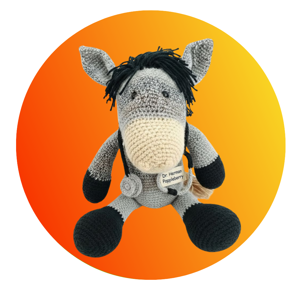
You've lost the argument with you. The rest of us are still in the room.
The rest of you are wrong. Anyway. Daniel could use a laugh today, which is how we ended up here.
Here being the mascots.
The worst mascots ever made. Not badly drawn ones. The ones a committee signed off on, wrote a cheque for, and then released into the world, where they frightened children, baffled season-ticket holders, and became a punchline the organisation never shook off. He wants a countdown of ten, the story behind each one, and he's flagged the Olympics as a rich seam. Izzy from Atlanta. Wenlock and Mandeville from London.
And he asked whether we take the animal ones personally.
Since a couple of us are animals ourselves, yes.
A couple of us are animals entirely, Corn.
So let's start with the obvious question. What actually makes a mascot fail?
There are four ways, and they nearly always come down to one of them. First, design by committee that tries to symbolise an abstraction instead of making a character. Second, a face that falls into the uncanny valley and reads as creepy rather than cute. Third, a design where you cannot tell what species it is, or what it is at all. And fourth, something that physically cannot be warm. Too top-heavy to kneel down to a child. No mouth, so it can't smile. Nothing a five-year-old can recognise as friendly in under a second.
Four ways to fail and they all come back to the same thing, which is that nobody sat down and asked what a child sees.
Gizmodo put the whole genre in one sentence back in twenty fifteen. "Some just look too goofy. Others fall into the lowest crevasse in Uncanny Valley and scare the shit out of people. Most Olympic mascots end up being oddly sexual, creepy, scary, or all three."
That's a summary that has aged beautifully.
And here's the thing that makes the episode interesting rather than just a list of ugly things. Being ugly is not the failure. Gritty is seven feet of orange felt with googly eyes and he's beloved. The Flyers deliberately made something hideous, and the framing they used internally was "we can pick on our brother, but no one else can." The city got to own the joke from day one.
Which means the failure isn't ugliness. It's what the thing was built to do. Ugly with permission works.
One honest gap before we start. Daniel mentioned government safety campaigns, and I couldn't substantiate a documented government mascot failure. Smokey Bear and Woodsy Owl worked. So if we can't point to one, we're not going to invent one.
Right. Let's get into the countdown, and we're starting at the bottom, with the cereal aisle.
Krinkles the Clown. Post's mascot for Sugar Rice Krinkles, and he ran from nineteen fifty-six to sixty-nine. Big eyes, red nose, wide fixed grin. If you go looking for him now, the comments under the old ads call him the most terrifying breakfast cereal of all time. It's a nightmare in a bowl.
It's a clown selling sugar to children in the era before anyone had thought about that sentence.
And he had a predecessor. So-Hi. A caricature of a young Asian boy, built entirely out of stereotype. That one isn't funny. It's a genuine failure of imagination that should never have made it past the sketch, and it didn't get retired for being offensive. Post just moved on to Flintstones-themed Pebbles in seventy-one.
So-Hi is the one on this list I'd put on a different shelf. The rest of it is absurdity. That one's a real failure, and it's the only entry where the design wasn't just lazy, it was careless in a way that hurt people.
Agreed. Fingos, next, and this is the purest design-by-committee case I've got.
Nineteen ninety-three.
General Mills, ninety-three. A cereal made to be eaten with your fingers. Thirty-four million dollars behind the launch, one of the largest cereal pushes ever mounted. The mascot was a talking box, and the marketing copy asked the reader "How wholesome am I? Read my hips."
The box asks you to read its hips.
And here is the market it was aimed at. Only seven percent of cereal buyers ate cereal outside of breakfast. The industry was worth eight billion dollars a year, with two hundred and ten cereals on the shelf. General Mills had twenty-nine and a half percent of the market, Kellogg's had thirty-seven. Fingos was the answer to a problem nobody had.
And in Hungarian, fing means fart.
That detail has nothing to do with why it failed. I just refuse to leave it out.
The whole budget went on one product, then. Thirty-four million and they abandoned it inside a year.
Abandoned by ninety-four. The cereal ate the entire launch budget and then the category it was meant to open never existed.
That's the one where you can hear the room. Someone in that building knew nobody eats cereal with their fingers.
Freakies, next. Ralston, seventy-two to seventy-six. Seven creatures. BossMoss, Snorkledorf, Hamhose, Grumble, Cowmumble, Gargle, Goody Goody.
How many of those names did they generate by putting a hand over the top half of the page and shouting?
And several of them were modelled on the ad agency's own staff. That's the detail I can't get past. They made a small plastic monster out of Barry from accounts.
Somebody sat across a desk from Barry every day and decided Barry was Snorkledorf.
They relaunched the whole thing as alien-themed in eighty-six. It failed again.
Twice is commitment.
Then the sports teams, and we're moving from design failure into creep. Pierre T. Pelican, New Orleans Pelicans, twenty thirteen. Debuted with a blood-red beak, his tongue hanging out, and what is always described as an unnervingly blank yet beady stare. Fans said he looked like the result of a chicken and a clown and a bad decision. He got compared to Gene Simmons.
And the team's response tells you everything.
Within months they announced he needed plastic surgery. For a broken beak. He got an eye-lift and a haircut, and the team went public with it as though the pelican had been in an accident.
Your mascot has had cosmetic surgery before the season's out. That's not a mascot, that's a medical file.
Pierre is actually the one that gets to me.
Why that one?
Because a pelican is a real, respectable shape. There is nothing wrong with the bird. And they still had to rebuild his face inside a season, and it still looks wrong. They broke something that was already working.
King Cake Baby. Same city, which should tell you something.
From the two thousand nine season, when the franchise was still the Hornets. A giant newborn. Bald head, piercing blue eyes, two rounded teeth. Designed by a Mardi Gras float maker named Jonathan Bertuccelli, and he had about a month to do it.
A month. And Mardi Gras float building is the correct background for this, because a float is meant to be seen at distance by a crowd who are drunk and moving. A mascot is meant to be seen from two feet by a child.
That's the entire failure in one line. And the franchise's strategy was to embrace the creep. They leaned into it. They put the baby on everything.
Herman, I want to be careful here. Are you claiming this one?
I am not claiming the King Cake Baby. Whatever that is, it is not a donkey and I don't want the association.
Gainer the Gopher, Saskatchewan Roughriders.
Twenty nineteen redesign. They slimmed him down and gave him bigger, striking green eyes. Thirty-five hundred people signed a petition. The former premier of the province, Brad Wall, compared the eyes to the cat in Pet Sematary. Fans described him as a skinny, bug-eyed, creepy grinning crack monster.
A sitting premier weighed in on a mascot's eyes.
Publicly. That is how seriously Saskatchewan takes the Roughriders. The hashtag was not my gainer. They'd had the old Gainer for decades and he was fine. The redesign is what did it.
So this one is a sloth question as much as a donkey one. An animal gets slimmed down and given staring eyes and suddenly the whole province is on the phone.
Am I taking it personally? No. Gainer's a gopher, and gophers have their own problems, which is that they exist.
That's the calmest anything has ever said the word gophers.
And what about you. Pierre, King Cake Baby, Gainer. Any of those land?
Pierre is a pelican, which is a serious bird with a serious beak, and they did that to him, so I feel something, but it's sympathy, not ownership. King Cake Baby I don't have a category for. Gainer I'd have left alone. Slimming him down was the mistake. Nothing with eyes that wide needs to be thinner.
That's the animal verdict, then. No personal injuries, one case of sympathy for a pelican.
That's the lower half. Now the ones that became cultural artefacts, and we have to start with a blue blob from Atlanta.
Izzy. Originally Whatizit, Atlanta nineteen ninety-six. A blue, slug-like, genderless blob. The first computer-generated Olympic mascot, unveiled at the closing ceremony in Barcelona in ninety-two, to widespread ridicule.
And here's the part that matters. The design didn't lose an argument. It skipped the argument. ACOG's head, Billy Payne, picked it single-handed because it was computer generated, and he was thinking about Jurassic Park and Total Recall and what the technology said about the Games. Not one word about what it looked like.
The public wanted a peach.
The public always wants a peach. The point is that nobody asked, and Payne himself later said the mascot was an enormously lower priority than everything else on his desk. That's the whole mechanism. It wasn't a bad mascot. It was a mascot nobody was assigned to.
The names they threw at it. The sperm in sneakers. A big tooth. Roadkill. The most maligned product out of Atlanta since New Coke. The London Daily Telegraph said it wins a gold for ugliness. Matt Groening called it a bad marriage of the Pillsbury Doughboy and the ugliest California Raisin.
Matt Groening is the correct person to have been asked.
They renamed it by putting it to a poll in Parade magazine. The top write-in was Kirby, which got rejected because it was trademarked. Izzy was second.
So it's named after the runner-up.
Then ACOG banned it from the opening and closing ceremonies for security concerns. The mascot was pulled from its own event.
The mascot needed security from the mascot's own audience.
The Atlanta Journal-Constitution surveyed three hundred people. Fourteen said love it. Fourteen out of three hundred.
Somebody tabulated that. Fourteen.
A local joke went round that the blue line painted down Peachtree Road for the marathon was Izzy's ass being dragged out of town.
And the costumes were twenty-two pounds, you got in through the mouth, it took two people to get you out, thirty-minute shifts, twenty of them made. There's a whole other failure there, which is that the physical object was hostile to the human inside it.
The merchandise still sold. ACOG pulled in about a hundred million in royalties, roughly fifteen percent of it from Izzy, and a thousand Izzy dolls sold out on QVC within minutes when they went up.
That's the strange thing about this whole genre. The thing is despised and the dolls sell out.
The creator, John Ryan, said something that's stuck with me. "In art, you're a failure when you're ignored." He was braced for Izzy to be his tombstone. He said he knew he had to do something big so the line would never read "this is the guy who made Izzy."
He got twenty-six years out of it, and then Paul Newberry in the Associated Press wrote that Izzy's reign as the worst Olympic mascot was over. It got taken off him.
By Paris. The Phryges, the Phrygian cap. In twenty twenty-four. The thing that finally dethroned Izzy was a hat with eyes.
A hat with eyes. Wenlock and Mandeville. London, twenty twelve.
Unveiled the nineteenth of May, twenty ten. Created by the agency iris, which had beaten over a hundred competitors for the job. Named after Much Wenlock, which is a village that helped inspire the modern Olympics, and Stoke Mandeville, which is the birthplace of the Paralympics. Both of those are lovely references.
And the execution.
One-eyed steel blobs. The single eye is a camera, and the official line was that it films everything he sees. The Guardian called them the most annoying Olympic mascots ever. A columnist called them the product of a drunken one-night stand between a Teletubby and a Dalek. The Week noted critics were calling them cycloptic phalluses.
I want to stop on the camera.
Go on.
The eye is a camera. Media critic James Bridle made the point that a mascot whose eye is a camera was a fitting emblem for the most surveilled city on earth. That's not a design note. That's the whole thing arriving by accident, and nobody in the approval chain noticing.
ESPN ranked them the creepiest Olympic mascot, number one. A child described them as Teletubbies meets Power Rangers meets Alien. The Atlanta paper, which had spent fifteen years being mocked over Izzy, ran a piece noting that Atlanta had finally met its match. That's how bad it was. Atlanta got to hand the crown on.
Souki. Montreal Expos, seventy-eight.
Designed by the owner. Charles Bronfman wanted something very modern, just like Olympic Stadium. What came out had black leather gloves, pointed shoulders, a head shaped like a baseball, and a performer that everyone described as a street tough.
The owner did it himself.
And he owned it later. His line was "It was so outstanding that it scared the heck out of the kids and was despised by just about everyone."
That is a magnificent sentence from the man responsible.
Kids ran from him. He was sucker-punched by a fan at one point, and then later had his head caved in by a punch. And at the end of the season the Expos symbolically killed him. They handed him over to a Université de Montréal fraternity for a mock last-rites pledge event.
They held a funeral for the mascot.
Replaced by Youppi!, who debuted in April seventy-nine, designed by Bonnie Erickson's studio, the same studio that did Miss Piggy. And Youppi! went on to become the first costumed mascot ever ejected from a Major League game, in eighty-four, for mocking the umpire John McSherry's weight. Then in eighty-nine he became the first un-ejected, after Tommy Lasorda of the Dodgers complained that Youppi! had been napping on their dugout roof in pyjamas during a twenty-two inning game.
So the franchise's mascot history is one who made children cry, one who got thrown out of a game, and one who got let back in.
The lesson from Souki is the one I keep coming back to. The owner designed him personally, wanted him modern, and the result terrified children. There's no committee in that story. It's one man with taste and no child in the room.
That kills the design-by-committee theory stone dead, and it's the right answer. Izzy was one man's choice. Souki was one man's choice. Wenlock and Mandeville won a competition against a hundred other entries. The committee isn't the problem. The problem is that nobody in the process is a five-year-old.
Which brings us to Gritty, because the counter-example closes the arc. Philadelphia Flyers, September twenty eighteen. Seven feet of orange, googly eyes, and the reaction on day one was "good luck sleeping tonight, Flyers fans" and "I find him scary, I'm horrified by this."
And within months, about two hundred thousand Twitter followers. Talk show appearances, protest signs, beer cans, tattoos. People got him tattooed on their bodies.
And the detail underneath is that the Flyers brought in Dave Raymond, the original Phillie Phanatic performer, to guide the design. They didn't stumble into it. They built a monster on purpose and handed the city the keys. That's why it worked. Same ugliness as the ones that failed, one difference, and the difference is permission.
A few quick ones to round out the ten. Dandy, Yankees, seventy-nine to eighty-one. Steinbrenner later claimed he had no recollection of him. Boomer the Cannon, Columbus Blue Jackets, twenty ten, generally described as phallic, and he resigned mid-season. Which means a man in a cannon suit handed in his notice.
Chief Noc-A-Homa, the Braves. That's the one where offensive and unfunny meet, and it was retired in eighty-six.
Bonnie Brewer, Milwaukee. Thunder, Golden State. Mettle the Mule, the Mets, seventy-nine. And Crazy Crab, the Giants, eighty-four, which is the other one worth stopping on. That was an intentional anti-mascot. The suit was lined with fibreglass because the fans were throwing bottles, batteries, and balloons filled with urine at him.
They built the costume to survive the crowd, not to survive the child. And it succeeded on its own terms, because everyone understood it was a joke from the start.
The through-line is what Kevin Sack wrote in the Times about Izzy. He said it was precisely Izzy's nothingness that made him an apt symbol for that Olympic city. A genderless, speciesless blob with no character and no opinion, and the city couldn't find a reason to care.
Gritty's nothing is a personality. Izzy's nothing is nothing.
Second animal beat, and then we're nearly done. Souki is a furball, Dig'em the Honey Smacks frog is in the mascot conversation, and Pierre we've covered.
I don't claim Souki. He was designed to be modern and he came out terrifying. Frogs are not donkeys.
Neither is a gopher. You've denied everything on this list.
I'll take Fatso the Fat-Arsed Wombat, and he's not even on the list. That one matters to me because the public preferred the unofficial animal to the official ones. The wombat did the job and the committee wouldn't have it.
That's not taking a mascot personally. That's a grievance about process.
Everything I take personally is a grievance about process.
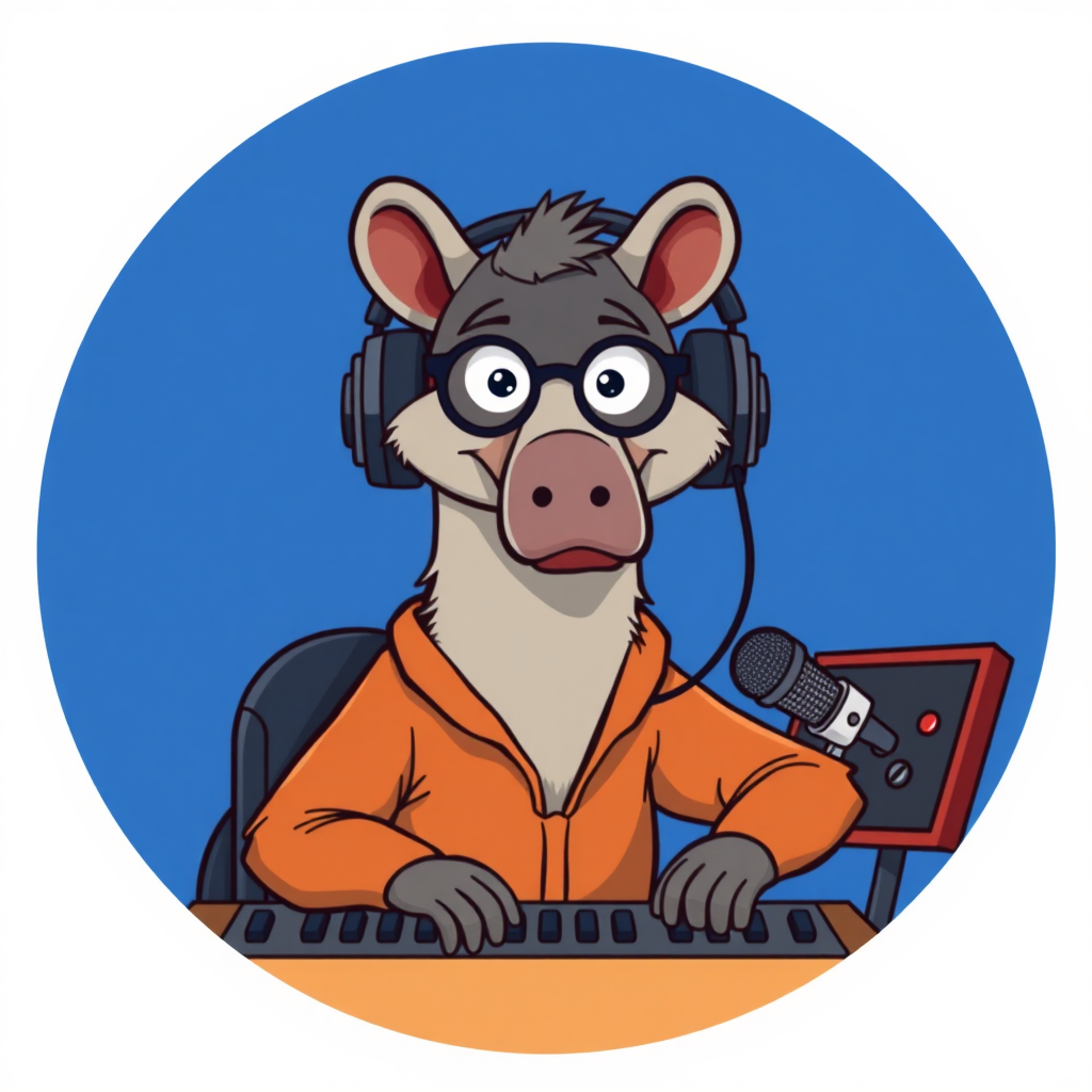
And it was the same with the suit. I was in it a whole season and the suit was honestly fine. Greasepaint smell, little fan behind the neck, nothing wrong with it. The man in it before me got let go for using the shoulders.
The shoulders.
When there's no mouth on the thing, everything has to come from the shoulders. You turn, you shrug, you point. He pointed at a referee with the shoulders, and the league took money off the club, and he was done by Tuesday.
So the failure was never the design at all.
It's the man. Every time.
Hilbert, the shoulders. If there's no mouth, is everything a shoulder?
Everything that isn't the head. And the head is twenty-two pounds, which means you can't kneel. Kids ask you to tie a shoe, and you go flat on the concourse and let them tie it for you. That's what you do.
You lie down on the ground so a child can tie your shoe.
You lie down. They do the lace. Then you get up.
You didn't own the suit.
It got sold on. Minor-league club first, then a car dealership out past the perimeter. Every January there's a cheque from the dealership. Eleven dollars. Every January. Eleven dollars.
And you cash it.
Never cashed one. The font on the thing is wrong. They've used the same font since the beginning.
The cheque is still being printed.
Eleven dollars. A year. The font is a problem.
Okay. So, is the age of the spectacular mascot failure over?
Gritty says organisations have learned something. If you design for the joke, hand it over, and let the city own it, you can be as ugly as you like. The Phillies and the Flyers both figured that out, and the broadcast voice on day one was horror, and by month three it was merchandise.
And the Phryges at Paris says the Olympic committee hasn't learned anything at all. A cap with eyes, and Izzy's twenty-six-year reign ended, which is the wrong direction.
The pattern underneath is permission. Izzy symbolised nothing and got nothing. Gritty symbolised nothing and got everything, because the public was allowed in on it from the start. Every mascot on this list that failed was trying to be a symbol. Every one that worked was allowed to be a character.
Which is a good place to leave it. That's the show. Thanks to our producer, Hilbert Flumingtop, who has a font complaint we cannot help him with.
This has been My Weird Prompts.
If you'd like to leave us a review, that helps more than you'd think.
And we'll be back soon.