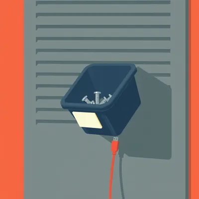
Daniel sent us this one — he bought a vertical mouse, a Logitech, on an AI's recommendation, and noticed it had a Red Dot design award on the box. Then he looked at his Bosch Serie 6 vacuum cleaner, same thing. His question is basically: what is this award, when did it start, how many products get it every year, and what does it actually mean? Because his observation is that the common thread across these products isn't top specs — it's that they're so pleasant to use you forget they're tools at all. That's a pretty sharp observation to build from.

It really is, and it gets at something the award's own criteria tries to measure but rarely gets articulated that cleanly. The Red Dot Design Award started in nineteen fifty-five. It's German, based in Essen, run by an organization called the Design Zentrum Nordrhein Westfalen. The founding figure was a guy named Professor Dr. Peter Zec, and the original name was actually "Industrieform" — literally "industrial form." It became Red Dot in the nineteen nineties.
It predates the branding by about four decades. What was it doing for all that time before anyone called it Red Dot?
Running an annual industrial design competition, mostly focused on German and European manufacturers. The real shift came after German reunification, when Zec rebranded it and built it into an international thing. The red dot itself — the logo — came from his office. He had a red dot on his door, apparently. The symbol became the name, the name became the brand, and now it's one of the three big international design competitions, alongside iF — also German — and the IDEA awards in the U.
What you're telling me is one of the world's most recognized design awards is named after a sticker on a guy's office door. That's almost too perfect.
It's the design equivalent of naming your band after the street you grew up on. But it works. The thing to understand about Red Dot is it's not one award — it's three separate competitions under one umbrella. Product design, which is what Daniel's mouse and vacuum won for. Brands and communication design. And design concept. Each has its own jury, its own timeline, its own fee structure.
Let's stay on product design, since that's what the prompt is about. How many products actually win this thing each year?
This is where it gets interesting, and where a lot of the criticism comes from. In a typical year, Red Dot receives about eighteen to twenty thousand entries across all three competitions. Product design alone gets around five to six thousand submissions from roughly sixty countries.
How many win?
In twenty twenty-four, they awarded about one thousand four hundred Red Dots in product design. That's roughly a twenty-five to thirty percent win rate among submissions. But that number includes all tiers.
Wait — there are tiers? I thought Red Dot was Red Dot.
Most people do. There's the standard Red Dot, which is the bulk of winners. Above that there's Red Dot: Best of Best, which goes to around one to one and a half percent of entries — so maybe sixty to ninety products a year. And then at the very top, there's the Red Dot: Design Team of the Year, which is a single award given to one design team annually. That one's a big deal — they get a trophy, a dedicated exhibition space, the whole thing.
When Daniel sees "Red Dot" on his mouse box, he's seeing something that roughly one in four entries receives. That's not exactly exclusive.
It's not, and that's the honest tension at the center of this award. But I think it's worth unpacking why a twenty-five percent win rate doesn't necessarily mean the award is meaningless. The submission pool is self-selecting. Companies don't submit junk products — there's an entry fee, which we should talk about, and the application process requires documentation, product samples, sometimes shipping heavy items to Germany. You're already looking at products where the manufacturer believes they have something competitive.
The real question isn't "is this the best product in the world," it's "does this clear a genuine quality bar." And Daniel's experience suggests the answer might be yes, at least for the products he's encountered.
And the bar is real. The jury is made up of around forty to fifty independent designers, design professors, and industry experts — they're not employees of Red Dot. Products are judged on nine criteria, and here's where Daniel's observation about UX gets validated. The criteria include degree of innovation, functionality, formal quality — meaning aesthetics — ergonomics, durability, ecological compatibility, and symbolic and emotional content.
Symbolic and emotional content. That's the "I forget this is a tool" dimension he was describing.
It's exactly that. The jury is explicitly asked to evaluate whether a product creates an emotional connection, whether it communicates something beyond pure utility. Daniel's vertical mouse isn't just a pointing device — it's an object that, in his words, is a pure joy to use. That's not an accident. That's something the award is designed to identify.
Let's talk about the money, because I suspect this is where things get complicated.
Oh, it absolutely is. Submitting a product to Red Dot isn't cheap. The registration fee varies by timing — early bird, regular, late — but for product design it ranges from about four hundred fifty euros to over seven hundred euros per entry. And that's just to have it judged.
So a company submitting five products could be in for a few thousand euros before anyone's even looked at them.
And if you win, there's what they call the "winner's package," which is where the real cost kicks in. You're required to pay a fee — typically starting around four thousand euros and going up depending on the size of your product, the exhibition space it requires, and additional services. This covers the trophy, the certificate, inclusion in the yearbook, presence in the online exhibition, and the right to use the Red Dot logo on your packaging and marketing.
Winning costs more than losing. That's quite a business model.
The Design Zentrum Nordrhein Westfalen is a private company. It's not a nonprofit, it's not a government body. The awards are their primary revenue stream, and they do very well — estimates put annual revenue in the range of fifty to sixty million euros. The Red Dot Design Museum in Essen, which is built on the site of a former coal mine — the Zollverein colliery, which is a UNESCO World Heritage site now — that's their physical presence, and it's genuinely impressive. But it's also a monument to the commercial success of the award itself.
The Zollverein colliery. So the temple of design excellence is a repurposed coal mine. That feels like a metaphor for something, though I'm not sure what.
Industrial past repurposed for aesthetic judgment? Something like that.
All right, so we've established the award is a paid competition with a meaningful but not hyper-exclusive win rate, run by a private company, judged by genuine experts against criteria that include the kind of experiential quality Daniel noticed. What about the criticism? Because I assume there's plenty.
There's a lot, and some of it is fair. The primary critique is exactly what we've been circling: Red Dot is often described as a pay-to-play scheme dressed up as an independent honor. The argument goes that when you charge substantial fees and then award a significant percentage of entrants, what you're really selling is marketing rights, not recognition.
The counterargument is that the jury doesn't know which entries are paid — the judging is blind in terms of fees — and that self-selection plus expert evaluation produces a real quality filter. Also, for smaller companies and design studios, a Red Dot is valuable. It signals to distributors, to retailers, to consumers that someone with design expertise has evaluated this product and found it competent. In markets like China and South Korea, a Red Dot is a significant selling point — it's displayed prominently in advertising, on store shelves, everywhere.
Which raises an interesting question. If the award is most valued in markets where consumers are looking for external validation of design quality, and less valued in markets where consumers trust their own judgment or brand reputation, then what the Red Dot really is is a form of design credit rating. It's Moody's for objects.
actually a really good way to put it. It's a third-party quality signal that matters most when the buyer doesn't have direct access to the product before purchase, or when the brand itself isn't well-known enough to carry the trust. Daniel bought his mouse online, based on an AI recommendation. The Red Dot on the box was a secondary confirmation — someone else had already vouched for it. But for a consumer standing in a store in Shanghai looking at fifty different vacuum cleaners, that red logo might be the deciding factor.
For Bosch — a massive, established brand — why do they bother? Everyone already knows Bosch makes good appliances.
Partly because it's table stakes at this point. When your competitors are all submitting, not submitting looks like you're afraid of the comparison. Partly because even for big brands, the award provides a specific, quotable validation for a specific product. It's not "Bosch is good" — it's "this specific Bosch vacuum was judged excellent by an independent panel." And partly because the award ceremony itself is a marketing event. It's held at the Aalto Theater in Essen, it's a gala, designers fly in from around the world, there's press coverage. It's an industry networking event as much as it is a competition.
It's simultaneously a genuine quality assessment, a marketing service, an industry social club, and a revenue-generating business. None of those things necessarily contradicts the others.
And I think that's why conversations about Red Dot get so confused. People want it to be one thing — either a pure, disinterested arbiter of design excellence, or a complete scam. It's neither. It's a well-run commercial enterprise that happens to employ genuine experts and produce reasonably reliable quality signals, at a price.
Let's get back to Daniel's actual experience, because I think it's the most interesting data point in all of this. He's not a design professional. He's a consumer who bought two products independently, both turned out to be exceptional, and both happened to have the Red Dot. He's asking: is that a coincidence, or is the award doing its job?
I'd say it's doing its job, with some caveats. The Red Dot criteria we talked about — especially ergonomics, functionality, and symbolic and emotional content — those map almost perfectly onto what he described. A vertical mouse that's comfortable enough to forget you're using it. A vacuum cleaner that's so pleasant to operate that you find yourself using it more than necessary. Those aren't spec-sheet victories. Those are design victories.
The phrase "addictive vacuum cleaner" is not something I expected to hear in this episode, and yet here we are.
It's high praise, though. Think about what a vacuum cleaner normally is: loud, awkward, something you tolerate. If Bosch made one that someone actively wants to use twice a day, that's a triumph of industrial design. And it's exactly the kind of thing the Red Dot jury is supposed to recognize — not just "does it suck dirt effectively" but "what does it feel like to live with this object.
Which brings us to the deeper question the prompt is really asking. What does it mean for a product to be so well-designed that it becomes an extension of your body? That's not just ergonomics — it's a philosophical claim about the relationship between people and objects.
There's a whole tradition in design theory about this. The philosopher Martin Heidegger had this concept of "ready-to-hand" — an object that you use without consciously thinking about it, like a hammer that disappears into the act of hammering. The moment you notice the hammer, something has gone wrong. The best tools are the ones that withdraw from conscious attention.
The Red Dot, at least in theory, is trying to identify objects that achieve that. Objects that don't demand you think about them as objects.
Yes, though I'd argue that's an almost impossible thing to judge in a laboratory setting. The jury evaluates products in a dedicated exhibition space. They can touch them, operate them, examine them — but they're not living with them. They're not vacuuming their own rugs or using the mouse for eight hours of work. The real test of "does this disappear into use" happens over weeks and months, not in a judging session.
What the jury is actually evaluating is the likelihood that a product will achieve that. They're making an educated prediction based on materials, fit and finish, apparent ergonomics, design coherence. It's more like a pre-flight check than a flight review.
And it explains why some Red Dot winners turn out to be disappointing in real-world use, while others — like Daniel's mouse — exceed expectations. The award is a strong signal, but it's not infallible.
Let's talk about what brands actually do to win these things. Is there a playbook?
There absolutely is. First, companies decide which products to submit — and they're strategic about it. You don't submit your entire catalog. You submit products where the design story is clearest, where the innovation is most legible to a jury that spends maybe fifteen to twenty minutes with each entry. Products that photograph well, that feel good in the hand immediately, that have an obvious point of view.
Products that make a strong first impression. Which is different from products that wear well over time.
It can be. The best products do both, but the judging format inherently favors immediate impact. That's one of the structural limitations. Another part of the playbook: companies often work with design consultancies that specialize in award submissions. There are firms whose entire business model is helping clients win Red Dots, iF awards, Good Design awards. They know what juries respond to, they know how to prepare submission materials, they know which details to emphasize.
That feels like gaming the system, but I suppose it's also just... If you're going to enter a competition, you should understand how the competition works.
I'd say it's both. It's competence, and it also produces a certain homogeneity in award-winning design. There's a recognizable "award bait" aesthetic — clean lines, matte finishes, subtle curves, a certain restraint. Products that are weird or challenging sometimes win, but the system selects for a particular kind of good design.
The musical equivalent of beige wallpaper — but really, really well-made beige wallpaper.
Though I'd defend beige wallpaper when it's done exceptionally well. The Bosch vacuum Daniel loves probably isn't visually shocking. It probably looks exactly like what you'd expect a good vacuum to look like. The design is in the details — the balance, the grip, the way the attachments click into place, the sound damping. Those things don't photograph.
Which is another structural limitation. A jury can't fully evaluate sound damping, long-term durability, or how a product ages. They're making inferences from materials and construction quality.
From the manufacturer's reputation. Let's be honest — a submission from Bosch or Logitech enters the judging room with a different set of assumptions than a submission from a startup no one's heard of. The jury is supposed to evaluate blind to brand, but in practice, some products are recognizable. And even when they're not, the quality of the submission materials, the fit and finish of the prototype or production sample — those things correlate with company resources.
The Red Dot is, among other things, a signal that the company had the money and organizational competence to mount a professional submission. Which is not nothing. It tells you the manufacturer cares enough about design to invest in this process.
That's an underappreciated point. Submitting to Red Dot is a hassle. You have to prepare documentation, ship products, pay fees, handle logistics. A company that does all that is signaling that design matters to them. A company that wins repeatedly is signaling that they have sustainable design processes, not just one good product.
Let's talk numbers again. You said about one thousand four hundred product design awards per year. Over the history of the award, that's a lot of red dots.
Since nineteen fifty-five, we're talking tens of thousands of awarded products. The Red Dot is not rare in absolute terms. But it's also worth noting that the number of consumer products released globally each year is enormous — we're talking millions of SKUs. Even one thousand four hundred awards represents a tiny fraction of what's on the market.
The Red Dot on a box is filtering for something. It's not one in a million, but it's not one in ten either. It's one in... what, a few thousand consumer products, roughly?
Something like that. The denominator is hard to pin down, but the point stands. The award is selective enough to be meaningful, broad enough to be commercially viable for the organization running it.
I want to go back to something Daniel said about his mouse purchase — that he totally entrusted the decision to an AI. That's a fascinating context for a design award. If people are increasingly buying products based on AI recommendations, what role does an award like Red Dot play? Is it a training data point for the AI? A confirmation for the buyer?
It's increasingly a training data point, whether Red Dot intends it to be or not. When an AI recommends a product, it's synthesizing reviews, specs, ratings, and signals like awards. A Red Dot is a clean, binary signal — this product was judged excellent by experts. It's the kind of thing machine learning models love, because it's structured data that correlates with quality.
Which means the award might actually become more valuable over time, not less. In a world where AI mediates more and more purchasing decisions, having a recognized quality signal that predates the AI era gives you a kind of authority that's hard to replicate.
That's a really interesting point. The Red Dot has been around for over seventy years. It has institutional weight. An AI can't independently verify whether a product is well-designed — it can only aggregate human judgments. Awards like Red Dot are high-quality human judgments, made by people who've dedicated their careers to evaluating design. That's valuable input.
Of course, the AI doesn't know about the fee structure or the twenty-five percent win rate. It just sees "award: Red Dot" and weights it accordingly.
Which is both a feature and a bug. The AI is treating the signal at face value, which is what most consumers do. The nuance we've been discussing — the self-selecting submission pool, the commercial aspects, the judging limitations — that's invisible to the algorithm and to the average buyer. But the basic correlation between "won a Red Dot" and "is a competently designed product" holds up well enough that it's a useful heuristic.
Daniel's AI recommended a Red Dot-winning mouse, and it turned out to be excellent. That's the system working as intended. The question is whether it works as well for product categories where the Red Dot criteria are less aligned with what actually matters to users.
That's the crucial caveat. Red Dot evaluates design quality — aesthetics, ergonomics, innovation, emotional content. For something like a mouse or a vacuum cleaner, those things map closely to user satisfaction. For something like enterprise software or a medical device, the connection is less direct. A hospital's MRI machine might win a Red Dot for its industrial design while being a nightmare to actually operate. The award is measuring something real, but it's not measuring everything.
Which brings us back to the "extension of your body" idea. That's not really about aesthetics or innovation in the abstract. It's about a specific kind of fit between object and user. And that fit is partly subjective — what's ergonomic for Daniel's hand might not be ergonomic for mine.
Right, and that's where the AI recommendation gets interesting. The AI didn't just recommend "a Red Dot-winning mouse." It recommended a specific vertical mouse, presumably based on reviews and ergonomic data and user feedback. The Red Dot was one signal among many. The fact that the recommendation worked out well doesn't necessarily validate the award so much as it validates the AI's ability to synthesize multiple signals effectively.
Though Daniel's second data point — the Bosch vacuum — wasn't AI-recommended. He bought it, noticed the Red Dot after the fact, and found the same pattern of exceptional user experience. Two for two is a small sample, but it's not nothing.
It's not nothing, and it's consistent with what we know about how the award works. Bosch and Logitech are both companies with serious design cultures. They're not buying awards; they're submitting products that were already designed to high standards, and the jury is correctly identifying those standards. The system works when the inputs are good.
I want to circle back to the history for a moment. Nineteen fifty-five. What was happening in industrial design at that point? What was the context that made someone say "we need an awards program for this"?
Post-war reconstruction, especially in Germany. The Wirtschaftswunder — the economic miracle. German industry was rebuilding, and there was a conscious effort to move away from the aesthetic legacy of the Nazi period and toward a modern, forward-looking design language. The Bauhaus had been shut down by the Nazis in nineteen thirty-three; many of its faculty had fled to the U.In the nineteen fifties, there was a concerted effort to revive that tradition, to reconnect German design with modernism and internationalism.
The award was partly a cultural project. Not just "let's identify good products," but "let's define what good German design means in the post-war era.
The early years of Industrieform were closely tied to German industry and German design education. It was about setting standards, creating benchmarks, building a shared vocabulary for talking about design quality. The international expansion came later, but the DNA of the award is still in that post-war German design discourse.
Which is maybe why there's a certain aesthetic conservatism to a lot of Red Dot winners. The tradition it comes from values clarity, restraint, functionalism. It's not a tradition that rewards the baroque or the intentionally challenging.
I think that's fair. The Red Dot aesthetic is broadly modernist. Clean lines, honest materials, form following function. There are exceptions — they've awarded some pretty out-there concepts in the design concept category — but the product design awards tend to cluster around a particular vision of what good design looks like.
The iF award, which you mentioned earlier — how does it compare? Same basic model?
iF is also German, founded in nineteen fifty-three — actually slightly older than Red Dot. It's based in Hannover. Similar fee structure, similar jury process, similar number of awards. The two are often mentioned together, and many products win both. If you see a product with both the iF and Red Dot logos, it's probably been submitted to both competitions by a company that treats design awards as a standard part of their marketing strategy.
The IDEA award?
That's the American one, run by the Industrial Designers Society of America. Founded in nineteen eighty. Smaller scale — fewer categories, fewer awards. But it's considered equally prestigious in design circles. Between the three, you've basically got the triple crown of industrial design awards.
If you're a design-driven company, you probably budget for all three.
The total cost for a serious awards program — submitting multiple products to multiple competitions, paying the winner's fees, sending people to the ceremonies — can run into the tens of thousands of euros annually. For large companies, it's a rounding error in the marketing budget. For small studios, it's a significant investment that they hope pays off in credibility and visibility.
Which creates an access barrier. A brilliant product from a company that can't afford the submission fees never gets considered.
That's a real criticism, and Red Dot has made some efforts to address it — they offer reduced fees for students and young designers in the design concept competition. But for the main product design award, the cost is what it is. It's a commercial enterprise, and that means access isn't equal.
Though I suppose the counterargument is that a product that can't afford a four hundred euro submission fee probably has bigger problems than award recognition. If you can't scrape together the entry fee, you're probably not manufacturing at a scale where the Red Dot logo on your box would make a difference anyway.
That's a bit harsh, but not entirely wrong. The Red Dot is most valuable for products that are actually on the market, in distribution, competing for consumer attention. For a prototype or a concept, the exposure is the main value. For a shipping product, the logo is a sales tool. And if you're not shipping at scale, the sales tool matters less.
Let's address the elephant in the room — or maybe the anteater. Are there products that won Red Dots and turned out to be terrible?
The most infamous example is probably the Juicero — the Wi-Fi-connected juice press that became a symbol of Silicon Valley excess. It won design awards, including recognition from Red Dot adjacent competitions, before the whole thing collapsed. But more commonly, you see products that are beautifully designed and functionally mediocre. They look great in photos, feel great for the first five minutes, and then reveal themselves to be annoying to actually live with.
Which is the gap between what a jury can evaluate in a session and what a user discovers over months.
And that gap is inherent to the format. You can't run a design competition where the jury lives with every product for six months. You'd get maybe twenty entries a year, and the fees would be astronomical. The trade-off is built in.
Where does that leave us? Daniel's asking whether the Red Dot is a reliable signal of the kind of quality he experienced — the "extension of your body" quality. Based on everything we've discussed, I'd say: it's a reasonably strong signal, but it's not a guarantee. It means a product has been evaluated by experts and found to be well-designed according to a specific set of criteria. Those criteria overlap significantly with the things that make a product pleasant to use over time. But the overlap isn't perfect.
I'd agree with that, and I'd add that the signal is strongest for product categories where ergonomics, build quality, and design coherence are the main drivers of user satisfaction. Mice, vacuum cleaners, chairs, kitchen tools, headphones — things you physically interact with. It's weaker for products where the user experience is primarily about software, or where the design values being judged aren't the ones that matter most to users.
The other thing I'd say is that Daniel's experience highlights something that doesn't get discussed enough in design circles: the role of delight. He didn't just find his mouse comfortable. He found it a pure joy to use. That's not just ergonomics — it's something harder to define, a kind of rightness that goes beyond function. And the fact that the Red Dot criteria include "symbolic and emotional content" suggests they're at least trying to capture that.
They are, and I think that's what separates the good design awards from the purely technical ones. The recognition that objects have emotional lives, that using something well-made feels different from using something adequate. Daniel's description of forgetting the tool is a tool — that's the highest compliment you can pay an industrial designer. It means the object has successfully receded from conscious attention and become part of your embodied experience of the world.
Which is, when you think about it, an incredibly ambitious thing for an award to try to identify. You're asking a jury to predict, based on a brief encounter, whether an object will achieve that kind of disappearance into daily life. It's almost absurdly difficult. The fact that it works as often as it does is kind of remarkable.
And I think it works because good design is, to some extent, legible on contact. A well-balanced object feels right immediately. Good materials announce themselves. Thoughtful details are visible even if you don't consciously register them. The jury isn't starting from zero — they're drawing on decades of collective experience with what makes objects succeed or fail in use.
The Red Dot is a heuristic, not an oracle. It's a reasonably well-calibrated filter that catches a lot of good products, misses some, and occasionally lets through something that doesn't deserve it. For a consumer standing in a store or scrolling through online listings, it's useful information. For a company, it's a marketing investment that also provides genuine design validation. For a jury member, it's a chance to shape the direction of industrial design by rewarding certain kinds of excellence.
For the Design Zentrum Nordrhein Westfalen, it's a very successful business. Which, again, doesn't invalidate any of the above. The world is full of things that are simultaneously commercial enterprises and genuine public goods. The Red Dot is one of them.
I think that's a good place to land. The award is seventy-one years old, it evaluates thousands of products annually against a thoughtful set of criteria, it's run as a business with all the tensions that implies, and when it works — as it did for Daniel's mouse and vacuum — it identifies exactly the kind of design excellence that makes everyday life better in small but real ways.
If you're shopping for something you're going to use every day, seeing that red dot on the box is a reasonable reason to feel optimistic.
And now: Hilbert's daily fun fact.
Hilbert: In the eighteen forties, prospectors in the Yukon discovered that certain mineral pigments — particularly iron oxides from the Klondike region — produced an unusually vivid vermilion when ground and mixed with oil, a red that didn't fade even after years of exposure to extreme cold and sunlight. The pigment became briefly fashionable among European portrait painters before synthetic alternatives replaced it.
Prospectors and portrait painters, connected by a red that wouldn't quit.
Somehow that's the most design-appropriate fun fact we've ever had.
Thanks to Hilbert Flumingtop for that. This has been My Weird Prompts. If you enjoyed this episode, leave us a review wherever you listen — it helps. We'll be back next week.

")