Hey everyone, welcome back to My Weird Prompts. It is February twenty-sixth, twenty-twenty-six, and I am Corn. I am sitting here with my brother, Herman, and today we are getting into the technical weeds of something that most of us spend at least eight to ten hours a day staring at. We are talking about the photons hitting your retinas right now.

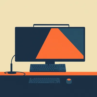
Herman Poppleberry here. And honestly, Corn, today is a bit of a meta day for us because we are literally looking at the very screens we are about to critique. Today’s prompt comes from Daniel, who is writing to us from Jerusalem. Daniel has a very specific setup that he has been using for a while, but he is starting to second-guess the science behind it. He is a photo and video editor, and for the sake of his eyes, he has been using an always-on blue light filter set to twenty-eight hundred Kelvin.
Twenty-eight hundred Kelvin. For those who do not have a color temperature chart handy, that is incredibly warm. That is the color of a sunset or an old-school incandescent light bulb. It is very yellow, almost orange. Daniel says he uses this static setting because he finds dynamic filters—the ones that shift the color temperature as the sun goes down—to be incredibly distracting for his workflow. He is wondering if this "always-on" approach is actually doing him more harm than good, and he also wants to know if dark mode is actually a health benefit or just a "hacker aesthetic."
It is a fantastic prompt because it hits that perfect intersection of professional standards, human biology, and daily utility. Daniel is trying to solve a real problem—digital eye strain—but he might be accidentally sabotaging his own biological clock and his professional accuracy in the process. We have touched on the circadian side of things back in episode eight hundred fifty, but Daniel’s situation adds a layer of professional complexity that we really need to unpack.
Let’s start with the biology, because that is the foundation of the "blue light is evil" narrative that has taken over the tech world in the last decade. Herman, we have talked about the "morning blue light" being a good thing. Why is Daniel’s twenty-eight hundred Kelvin filter potentially a problem at ten o’clock in the morning?
It comes down to a very specific part of our anatomy that was only really understood in the last twenty-five years or so. We all know about rods and cones for seeing shapes and colors. But we also have these things called intrinsically photosensitive retinal ganglion cells, or I P R G Cs. These cells do not help you see the image on the screen. Instead, they contain a photopigment called melanopsin, which is specifically tuned to detect short-wavelength light—specifically in the four hundred eighty nanometer range. That is the "blue" part of the spectrum.
And these cells are basically the light sensors for our internal master clock, right?
They send signals directly to the suprachiasmatic nucleus in the brain. When those cells detect blue light, they tell the brain, "Hey, it is daytime. Suppress the melatonin and start pumping out the cortisol." This sets your anchor for the entire twenty-four-hour cycle. It regulates your alertness, your metabolism, and even your mood. Now, here is the problem for Daniel: by keeping his monitor at twenty-eight hundred Kelvin all day, he is effectively starving those I P R G Cs of their primary stimulus. Even if it is high noon in Jerusalem and the sun is blazing outside, his primary visual focus is telling his brain that it is a perpetual sunset.
So he is essentially living in a state of physiological twilight. I can imagine that would lead to some serious brain fog or afternoon slumps. If your brain never gets that "clear blue sky" signal, it never fully enters "high-performance mode."
Precisely. There is a reason why high-end corporate offices invest millions in lighting systems that stay at five thousand or six thousand Kelvin during the day. It promotes cognitive function and focus. By locking himself into twenty-eight hundred Kelvin, Daniel is intentionally reducing his contrast and his blue light exposure during the very hours when he needs it most for alertness. It is like trying to run a marathon while your body thinks it is time for a bedtime story.
But Daniel’s concern is the "harshness" of the screen. He mentioned he turned the brightness down and shifted the temperature to make it easier on his eyes. We need to distinguish between "circadian health" and "digital eye strain," because they are not the same thing, even though they get lumped together in marketing for blue light glasses.
That is a huge distinction to make. Digital eye strain, or what doctors call Computer Vision Syndrome, is rarely caused by the color of the light itself. It is caused by two main factors: blink rate and accommodation. When we stare at a digital screen, our blink rate drops by about sixty to seventy percent. We just stop blinking because we are focused. That dries out the ocular surface. Accommodation refers to the tiny ciliary muscles in your eye that have to constantly flex to keep that digital image in focus.
So the "ache" Daniel feels isn't necessarily because the light is blue; it is because his eye muscles are doing a heavy workout without any breaks.
Now, blue light does scatter more easily than longer wavelengths—that is why the sky is blue, a phenomenon called Rayleigh scattering. This scattering can create a bit of "visual noise" or a slight haze, which can reduce perceived contrast. By shifting to twenty-eight hundred Kelvin, Daniel is increasing the long-wavelength light, which is easier for the eye to focus on. So, it might feel more comfortable in the short term, but he is paying a massive price for that comfort.
Let’s talk about that price, specifically for a photo and video editor. This is the part of the prompt that really jumped out at me. If you are color grading a video at twenty-eight hundred Kelvin, you are essentially wearing orange-tinted goggles while trying to paint a masterpiece.
It is a recipe for disaster, Corn. In the industry, the standard for color-accurate work is D sixty-five, which is sixty-five hundred Kelvin. That is the white point that almost all professional monitors are calibrated to. If Daniel is editing at twenty-eight hundred Kelvin, his brain is going to go through something called "chromatic adaptation." His brain will eventually try to convince him that the yellow-orange screen is actually "neutral."
Right, so if he sees a photo that is actually a perfect neutral white, it will look yellow to him on his filtered screen. So what does he do? He adds blue to the image to make it look "white" to his eyes.
And then he exports that file, and someone opens it on a standard iPhone or a calibrated MacBook Pro, and the image looks like a frozen tundra. It will be incredibly blue-shifted. This is why professional editors spend thousands of dollars on calibration hardware like the Calibrite Display Plus. You cannot trust your eyes if your baseline is shifting. By using an always-on twenty-eight hundred Kelvin filter, Daniel has essentially rendered his professional work non-standard. He is guessing, not knowing.
He mentioned that the dynamic shifting is distracting, which I totally get. If you are in the middle of a three-hour edit and the screen slowly turns orange, your perception of color is drifting while you work. That is a nightmare. But his solution of "always orange" seems just as problematic for the final product.
It really is. If he wants to be a professional, he needs a stable, calibrated environment. If I were in his shoes, I would look at the environment first. Daniel is in Jerusalem, which has some of the most intense natural light in the world. If he is working in a dark room with a twenty-eight hundred Kelvin screen, the contrast between the screen and the room is what is killing his eyes.
We talked about this in episode eight hundred twenty-eight regarding triple monitor setups—the importance of bias lighting.
Instead of slamming the monitor temperature down to twenty-eight hundred Kelvin, he should put a sixty-five hundred Kelvin L E D strip behind his monitor. This is called bias lighting. It illuminates the wall behind the screen with a neutral white light. This does two things: first, it constricts the pupil slightly, which increases the perceived sharpness of the screen. Second, it provides a "reference white" for his brain. It reduces the strain caused by the high contrast of a bright screen in a dark room without messing with the actual color data of his project.
That is such a better solution. It addresses the physical comfort without sabotaging the color accuracy. But what about the "blue light at night" issue? If he has a deadline and he is working at ten P M, he still has that sixty-five hundred Kelvin light hitting his retinas and keeping him awake.
That is where the "toggle" comes in. Daniel, if you are listening, stop using a gradual transition. Use a binary switch. Most professional monitors—and even software like DisplayCAL—allow you to have different profiles. During your work hours, you stay at sixty-five hundred Kelvin. You need that for your brain and your accuracy. Once the professional work is done and you are just browsing the web or answering emails, hit a hotkey and switch to your "relax" profile at twenty-eight hundred Kelvin.
It is like having a "work mode" and a "home mode" for your eyes. I think the mistake people make is trying to find one setting that works for twenty-four hours, but our biology isn't static. We are designed for high-contrast light environments.
Precisely. And speaking of settings, let’s tackle the second part of Daniel’s question: Dark Mode. This has become almost a religious war in the tech community. Is it actually better for your eyes, or is it just for the "hacker aesthetic" as Daniel put it?
I remember when dark mode first became a system-wide feature on Mac O S and Windows. People acted like it was the greatest health innovation since the discovery of vitamins. But the actual research on legibility and eye strain is a bit more nuanced, isn't it?
It is very nuanced, and in many cases, it is actually counter-intuitive. There is a phenomenon called "halation." When you have white text on a black background, the light from the white letters tends to bleed into the surrounding dark pixels. This is especially problematic for the millions of people who have even a slight astigmatism. It makes the text look blurry or "glowy," which actually increases the cognitive load required to read it.
I have definitely noticed that. If I am reading a long article in dark mode, my eyes feel like they are working harder to "grip" the words.
That is because they are working harder. In "light mode"—which is black text on a white background—there is more overall light entering the eye. This causes the pupil to constrict. Just like a camera lens, a smaller aperture—or a smaller pupil—results in a deeper depth of field and a sharper image on the retina. When you use dark mode, your pupil dilates to let in more light. This wider aperture makes it harder for the eye to maintain a sharp focus, leading to more "spherical aberration."
So for long-form reading, like a script or a long email, light mode is actually objectively better for visual acuity?
Generally, yes. Most studies show that reading performance is higher and fatigue is lower with "positive polarity"—which is dark text on a light background. However, there is a catch. In a very dark room, a bright white screen can be physically painful because the contrast is too high. This is where dark mode shines. It reduces the "luminous flux," or the total amount of light hitting your eye, which prevents that "flash-blindness" feeling.
So it is an environmental tool. If you are in a bright office, use light mode. If you are in a dark bedroom at midnight, use dark mode.
But Daniel mentioned he is a photo and video editor. In that world, dark mode is actually a functional requirement, but for a different reason. It is about "simultaneous contrast." If you have a bright white border around a photo you are editing, your brain will perceive the photo as being darker and less saturated than it actually is. By using a dark gray or black interface, you allow your eyes to see the true luminosity and saturation of the image.
So for the tools, dark mode is great. For the content, it depends on the environment. But Herman, I read a study recently—I think it was from twenty-twenty-four—suggesting that long-term exclusive use of dark mode might actually contribute to myopia, or nearsightedness. Is there any truth to that?
There is some emerging research on that, and it is fascinating. The theory is that because dark mode keeps the pupil more dilated, it might signal the eye to grow longer over time, which is the physical cause of myopia. Bright light, especially natural sunlight, triggers dopamine release in the retina, which helps maintain the correct shape of the eyeball. By living in a "dark mode" world all day, we might be depriving our eyes of the signals they need to stay healthy.
That is a huge point. So Daniel, sitting in Jerusalem, should probably be opening his curtains and letting that Mediterranean light in during the day, rather than hiding behind a twenty-eight hundred Kelvin filter and a dark mode interface.
Daniel, if you want to protect your eyes and your sleep, the best thing you can do is get ten to fifteen minutes of direct sunlight as soon as you wake up. That will set your circadian clock much more effectively than any software filter. Then, during your work day, use a calibrated sixty-five hundred Kelvin setting with a bias light behind your monitor.
And what about the "twenty-eight hundred Kelvin" recommendation? Is there a middle ground? If he feels sixty-five hundred is too "blue" or "harsh," is there a compromise?
Five thousand Kelvin is often the "sweet spot" for many people. It is often called "cool white" or "horizon daylight." It takes that piercing blue edge off without making everything look like a jar of marmalade. If he wants a static setting that he can leave on all day without destroying his color accuracy too much, five thousand Kelvin is a much more defensible choice than twenty-eight hundred.
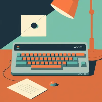
I also want to touch on the hardware side. Daniel mentioned he is worried about his YouTube recordings showing the orange tint. That happens because he is using a software filter like f dot lux or Windows Night Light. These filters literally change the data being sent from the G P U to the screen.
Right. If you take a screenshot while f dot lux is on, the screenshot is orange. That is a huge problem for a video editor. The pro solution here is to use a monitor with hardware-level calibration or a "Low Blue Light" mode that is handled by the monitor's internal scaler, not the software. High-end monitors from companies like BenQ or Eizo have "TUV Rheinland" certified hardware filters that reduce the blue light peak without shifting the entire image to orange.
And if he uses a hardware profile, he can record his screen and the recording will stay perfectly neutral because the "filter" is happening at the physical glass level, not the software level.
It solves the YouTube recording problem and the color accuracy problem in one go. It is a bit of an investment, but for someone doing professional work, it is a game-changer.
We should also talk about the "Twenty-Twenty-Twenty Rule" again. We mention it a lot, but for someone like Daniel who is clearly very concerned about eye health, it is the most effective tool in the kit.
It really is. Every twenty minutes, look at something twenty feet away for at least twenty seconds. This allows the ciliary muscles—the ones that are clenched to focus on your monitor—to finally relax. It is like stretching your legs after a long flight. No amount of blue light filtering or dark mode can replace the need for your eyes to change their focal point.
It is interesting how we try to solve these biological problems with software, when the solution is often just... looking out a window.
We are a very "near-sighted" society now, both literally and figuratively. We spend our lives looking at things within arm's reach. Our eyes evolved to scan the horizon for predators or prey. When we lock them onto a glowing rectangle for twelve hours, we are asking them to do something they weren't designed for. The fatigue Daniel feels is his body’s way of saying, "Hey, give me a break."
So, to recap for Daniel: First, the twenty-eight hundred Kelvin always-on setting is likely causing a "circadian mismatch." It is making his brain think it is sunset all day, which can lead to fatigue and low mood. Second, it is absolutely destroying his professional color accuracy. He should move toward a sixty-five hundred Kelvin or five thousand Kelvin baseline for work.
Third, he should invest in a bias light—a neutral white L E D strip behind the monitor—to reduce eye strain without messing with color. Fourth, use dark mode as an environmental tool, not a health mandate. If the room is bright, use light mode for better text sharpness. And fifth, get some real sunlight in the morning to anchor that internal clock.
It is about "light hygiene." We think about dental hygiene and sleep hygiene, but we rarely think about the quality of the photons we are consuming.
It is a great way to put it. You wouldn't eat the same thing for every meal, and you shouldn't "consume" the same light all day. You need the "protein" of blue light in the morning and the "fiber" of warm light in the evening.
Daniel also mentioned his son, Ezra, and his wife, Hannah. When you have a young child, your sleep is already under siege. You don't want to be making it worse by confusing your brain with your monitor settings. If Daniel is filtering blue light all day, he might find it harder to wake up when Ezra wakes him up at six in the morning.
That is a very real factor. The contrast between day and night is what makes the system work. If you flatten that curve by using a warm filter all day, your body loses its "rhythm." You want that big spike of blue in the morning so that when you finally turn it off at night, your brain actually notices the difference and starts producing melatonin.
This has been a really deep dive into the physics of how we work. I feel like I need to go recalibrate my own monitors now.
I think we all do. It is easy to set these things once and forget about them, but as our work habits change, our settings should too. And Daniel, seriously, look into that bias lighting. It is the single most underrated upgrade for any creative professional. It makes the screen feel like it is floating in the room rather than stabbing your eyes.
Well, I think that covers Daniel’s prompt. It is a lot to take in, but the takeaway is clear: use light as a tool, not just a background setting.
And thanks to Daniel for such a thoughtful question. It is rare that we get to talk about I P R G Cs and color grading in the same breath.
If you are listening and you have a weird prompt about the tech you use, the way your body works, or the intersection of the two, send it our way. We are always looking for new rabbit holes to jump down.
You can find us at myweirdprompts dot com, where we have an archive of all our past episodes. We have covered everything from the "Red Light Revolution" in episode seven hundred twelve to the physics of triple monitor setups.
You can also email us directly at show at myweirdprompts dot com. We read every single email, even if we can't get to them all on the air.
And if you are enjoying the show, please leave us a review on Apple Podcasts or Spotify. It genuinely helps other curious people find us, and it helps us keep the lights on—preferably at sixty-five hundred Kelvin.
Nice one, Herman. Also, a quick shout out to the music you hear at the start and end of the show. That is all generated with Suno, which is just mind-blowing to me. The tools we have in twenty-twenty-six are just incredible.
They really are. Well, I think my eyes have had enough of this screen for one session.
Same here. Let’s go find a window. Thanks for listening to My Weird Prompts. I am Corn.
And I am Herman Poppleberry. We will see you next time.
Stay curious, everyone. Goodbye.
Goodbye.

")